Data Visualization in Statistics
Numerical summaries like the Mean or Standard Deviation only tell half the story. Data Visualization allows us to see the shape, spread, and anomalies in our data that numbers might hide. In Machine Learning, visualization is the primary tool used during Exploratory Data Analysis (EDA).
1. Visualizing Distributions (Univariate Analysis)
To understand a single feature, we look at its distribution.
A. Histograms
A histogram groups continuous data into "bins" and shows the frequency of data points in each bin. It is the best tool for identifying the shape of the data (Normal, Skewed, Bimodal).
B. Box Plots (Whisker Plots)
Box plots are incredible for identifying outliers and understanding the quartiles of your data.
- The Box: Represents the Interquartile Range (IQR), containing the middle 50% of the data.
- The Line: The Median.
- The Whiskers: Usually extend to .
- Dots: Data points outside the whiskers are considered outliers.
2. Visualizing Relationships (Bivariate Analysis)
To understand how two features interact, we use relational plots.
A. Scatter Plots
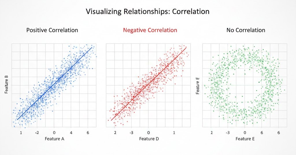
Scatter plots display individual data points on an XY plane. They are the first step in identifying Correlation.
- Linear Relationship: Points form a straight line.
- Non-linear Relationship: Points form a curve.
- No Relationship: Points look like a random cloud.
B. Bar Charts vs. Pie Charts
- Bar Charts: Best for comparing a numerical value across different categories.
- Pie Charts: Best for showing parts of a whole (though bar charts are often preferred for readability).
3. Visualizing Multiple Variables (Multivariate)
A. Heatmaps (Correlation Matrices)
In ML, we often have dozens of features. A heatmap uses color to represent the correlation coefficient between every pair of features. This helps in Feature Selection by identifying redundant variables.
B. Pair Plots
A grid of scatter plots for every pair of features in a dataset. It allows you to see relationships across the entire dataset at once.
4. Anscombe's Quartet: Why Visualization Matters
The most famous example of why we visualize is Anscombe's Quartet. It consists of four datasets that have nearly identical descriptive statistics (mean, variance, correlation), yet look completely different when graphed.
Never start training a model before visualizing your data. Plots often reveal data quality issues (like sensors being stuck at a maximum value) that summary statistics would miss.
Visualizing our data often reveals a specific "bell-shaped" curve that appears everywhere in nature and math. Understanding this curve is our next major step.