- Box Model: The CSS box model describes the rectangular boxes that are generated for elements in the document tree. Each box consists of content, padding, border, and margin areas. The width and height of an element are calculated by adding together the content width/height, padding, and border.
This is a div element with a box model
-
Positioning: CSS positioning allows you to control the position of elements on a web page. There are different types of positioning:
static: This is the default positioning. Elements are positioned according to the normal flow of the document.relative: Elements are positioned relative to their normal position in the document flow.absolute: Elements are positioned relative to their nearest positioned ancestor, or the containing block.fixed: Elements are positioned relative to the viewport, so they remain in the same position even when the page is scrolled.sticky: Elements are positioned relative to the viewport like fixed positioning, but they behave like relative positioning until they reach a specified scroll position.
Relative positioning
Absolute positioning
.relative {
    position: relative;
    top: 20px;
    left: 30px;
}

.absolute {
    position: absolute;
    top: 50px;
    left: 100px;
}
- Floats: Floats are a CSS property that allows an element to be taken out of the normal flow and placed along the left or right side of its container. Other content will wrap around the floated element.
.float-left {
    float: left;
}

.float-right {
    float: right;
}
- Flexbox: Flexbox is a one-dimensional layout model that provides an efficient way to distribute space among items in a container and align them in multiple ways. It allows you to create flexible and responsive layouts without relying on floats or positioning hacks.
.flex-container {
    display: flex;
    justify-content: space-between;
}

.flex-item {
    flex: 1;
}
-
Grid: CSS Grid Layout is a two-dimensional layout system that allows you to create grid-based layouts with rows and columns. It provides precise control over the placement and sizing of elements within the grid container.
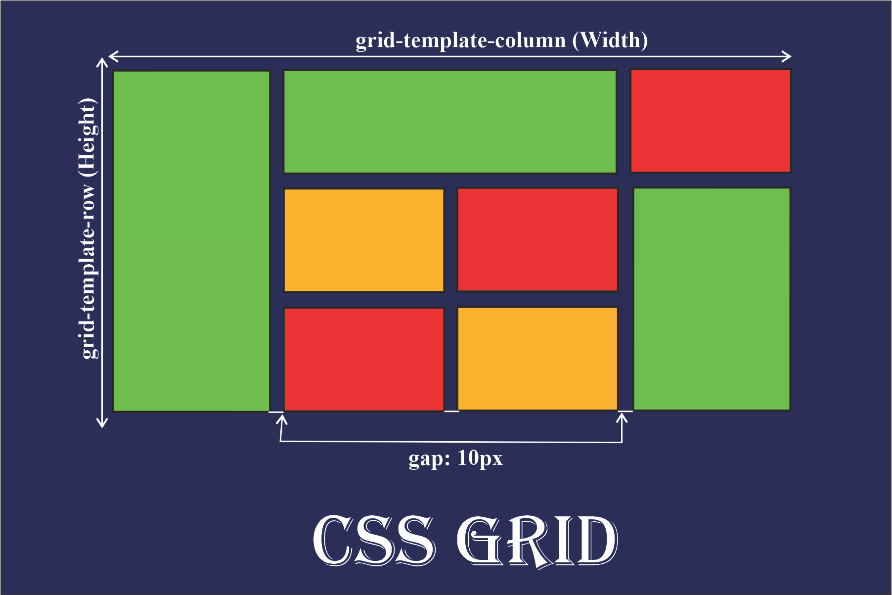
.grid-container {
    display: grid;
    grid-template-columns: 1fr 2fr 1fr;
    grid-gap: 10px;
}

.grid-item {
    background-color: lightblue;
    padding: 20px;
}
The fr unit, short for "fraction", is a flexible unit in CSS Grid Layout. It allows you to distribute available space among grid tracks (columns and rows) based on a proportion of the available space in the grid container.
Responsive design
Responsive design is an approach to web design aimed at creating web pages that provide an optimal viewing experience across a wide range of devices, from desktop computers to smartphones and tablets. The primary goal of responsive design is to ensure that websites adapt fluidly to different screen sizes, resolutions, and orientations, providing users with a consistent and user-friendly experience regardless of the device they're using.
Media Queries: Media queries are CSS rules that allow you to apply different styles based on various characteristics of the user's device, such as screen width, height, orientation, and resolution. By using media queries, you can create layouts that adjust dynamically to different device sizes and configurations.
/* Styles for screens smaller than 768px */
@media (max-width: 767px) {
    .navigation {
        display: none; /* Hide navigation menu on small screens */
    }
}

/* Styles for screens between 768px and 991px */
@media (min-width: 768px) and (max-width: 991px) {
    .sidebar {
        display: none; /* Hide sidebar on medium screens */
    }
}

/* Styles for screens larger than 1200px */
@media (min-width: 1200px) {
    .footer {
        width: 100%; /* Expand footer to full width on large screens */
    }
}